Have you ever had an image printed and instead of the team color blue you expected on a jersey or band uniform it came out purple? What the heck is that all about? Before you blame your color lab or your home printer (or anyone else for that matter), understand that the chances are your file was out of gamut.
What does that mean? A gamut is the range of colors that a color device can display or print. A color that may be displayed on your monitor in RGB may not be printable in the gamut of your CMYK printer. This is one of the most common issues photographers face and we know how important the accuracy of school or team colors is!
Oftentimes over-saturation of colors can also cause gamut issues. Let’s face it, who doesn’t like a vibrant color right? Your monitor can display your image in a way paper can’t produce and in that case, too much of a good thing isn’t a good thing, which equates to – out of gamut.
Let me add that you can use the gamut check even if you aren’t using a monitor that has been calibrated. You will want to use a calibrated monitor if you want to have the most accurate color you plan to correct, however. For more information about color calibration, check out Marathon’s website here – https://www.marathonpress.com/color-calibration/
So here are some tips to identify and quickly correct the out of gamut issue –
- Open the image in Photoshop. Under the view tab select check for gamut.
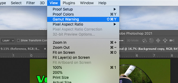
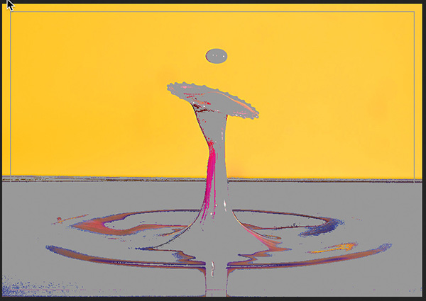
- The areas that have a gamut issue will turn gray.
- While there are multiple ways to correct this, the fastest way to bring your image back into gamut in Photoshop is to go to – Image/Mode/CMYK Color
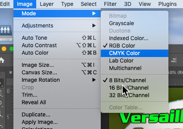
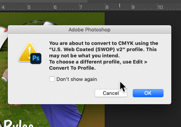
- This screen will pop up. Just select OK.
- Now go back to Image/Mode and select RGB Color.
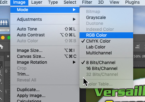
- Your image will now be back to gamut. You can verify by going to the View Tab and select – check for gamut. None of the gray will now appear. If you do need to make changes to the color to try to correct for a jersey looking too blue or too purple, etc, just remember to check the Gamut warning again to be safe. Often times Gamut warnings are associated with over-saturated colors. Sometimes you have to compromise the vibrancy of a color but hopefully, it will be minimal.
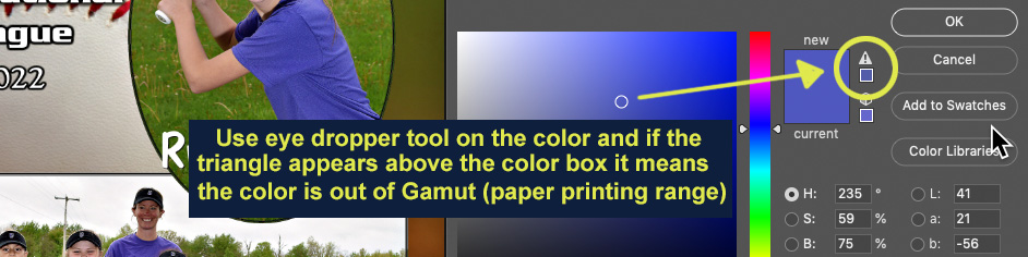
Another way to check color during post-production is to use the eyedropper tool and sample a color. If you see a triangle warning sign above the color sampled that means it is out of Gamut. The fix is the same as above. If you are doing some sort of artwork enhancement or color replacement and it samples out of gamut, just select a color that’s close but doesn’t give you the warning.
Have any questions about any of this? Feel free to contact me at 800-228-0629 ext. 283 or email me at markw@marathonpress.net.