introduction by Mark Weber, M. Photog., Cr., M. Artist, CPP
Recently I was looking through the 2022 PPA Image Excellence book for some inspiration for a photographic project I was working on. I came across this wonderful image titled – “Galactic Portal” by Marina Proskurina. After contacting Marina I discovered she has several PPA award-winning images that are simply stunning.
I invited Marina to share what inspires her to create such beautiful images.. Here’s what she shared –
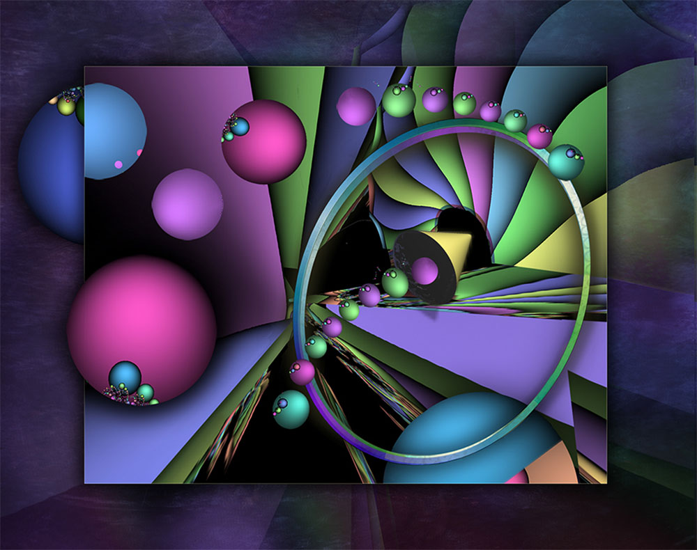
I have been planning to participate in 4 image PPA competitions, and I have some fragments and dimensional shapes that I collected in the past for this purpose. I enjoy combining them to create one composition and design the image. This technique has helped me create several of my PPA Image Excellence Images. I Love experimenting with outer space ideas.
“My biggest inspiration is the night sky, and I often imagine how many things are out there that we will never see!”
Marina Proskurina
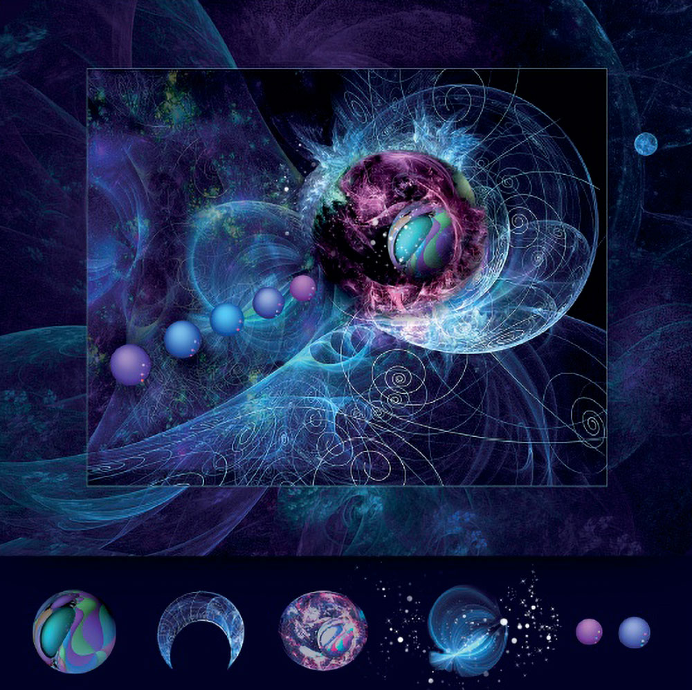
In this method, I used Corel Painter combined with Adobe Photoshop. No camera has been involved. Corel Painter produces clean vector lines, which can be rasterized and used in Photoshop.
As an artist, I always have a visible idea in my mind. Very often I see my images when I am sleeping and it is very helpful for visualization in my image design. And as for my layout, I always use the rule of thirds or make sure I have a solid focal point area.
People ask me about the shapes I use in my image. I have a collection of designs that I created many years ago using Corel Painter. Back then, Corel had a collection called Corel KPT, which they no longer offer. I took many classes at Daytona State College and FL School to study and improve my skills in Corel Painter. I did not copy or paste any of their designs, they were all created by me through design and composing in Photoshop!
It can be overwhelming knowing where to start with images like this. I find when designing an image, it is best to start with the focal point area. The top left corner is a great place to start, as it will grab the viewer’s attention immediately. The top right corner can be used to slowly lead the viewer’s eye to a nice focal point. The bottom left corner should be used to draw attention with a bold statement, while the bottom right corner can be used to lead the eye to a quieter and more subtle point of interest. Ultimately, it’s up to you to decide what to highlight in your image.
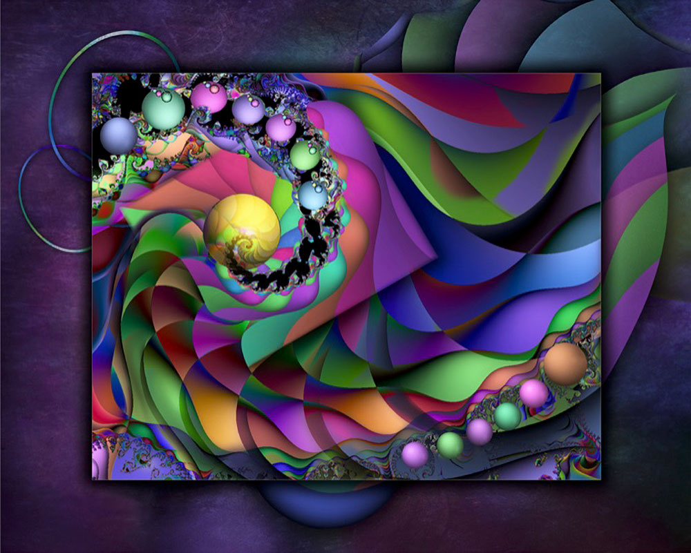
The use of jewel-tone colors and beautiful shading is a common denominator in almost all of my pieces. The image titled Kaleidoscope is an example of this. All gradients and color adjustments were completed in Photoshop with the main design in mind. Complimentary colors, as well as a variety of tones, add impact to each creation.
See more of Marina’s work here


People reacted to this story.
Show comments Hide commentsMarina\’s work has always been inspiring and her creativity is truly next level!
Very nice and imaginative work!
Comments are closed.