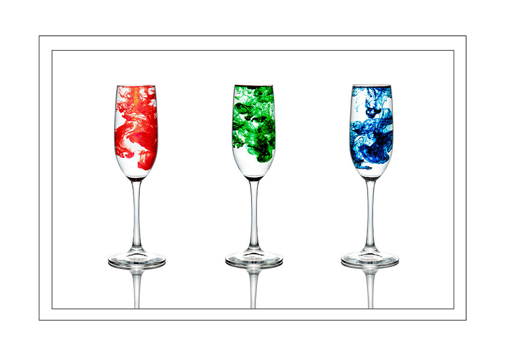
I like dramatic images. Drama and something unique or unexpected always draws my attention. So, when I saw an image of food coloring dispersing in water and the strange shapes it makes, I had to try it. I had this idea in my mind’s eye of three glasses filled with water, each with a different color cloud expanding in liquid.
When I started developing the concept, I knew lighting the glass was going to be a challenge. If you have ever tried taking a photo through a window you know it is hard to avoid reflections. I needed to learn a new lighting technique in order to get the image I wanted. Where is the best place to learn something new? YouTube of course.
I watched so many YouTube videos on how to light glass. I learned that because of its reflective nature, glass needs to be backlit. Placing the light source behind the glass illuminates the edges and contours giving it a defined silhouette. This helps add depth to the image and separates the glass from the background. Also, backlighting highlights the transparency of the glass while eliminating reflections.
At the time, I couldn’t find any videos that helped with what I was specifically trying to do. There were many videos on how to light glass but most of the tutorials were with empty glasses. I went through a lot of trial and error with water in the glass and making sure the food coloring didn’t get washed out.
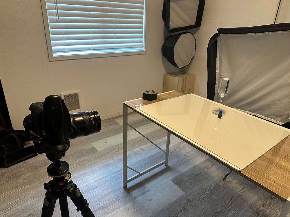
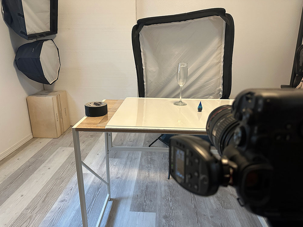
Setup: I put a white foam core board on the table and covered it with clear plexiglass. My A1 Profoto flash with a softbox was set up behind the table. I started with a drinking glass from my cupboard, a pitcher of water, and a box of brand-new food coloring. I set up the tripod, put the camera on burst mode, and found my wireless trigger.
While I started with a drinking glass from the kitchen, it didn’t have the look I was trying to achieve. The thick glass added a heaviness to the image that I didn’t want. In addition, the straight edges of this particular glass were so boring. I decide to head to the store to pick up an inexpensive champagne glass.
Why is it that photography projects are like home repair projects? Always running to the store for something you didn’t know you needed.
After returning to my home studio with my fancy new glass, I set it on the plexiglass and then started to work on the lighting. It was back and forth with YouTube and adjusting my light and exposure settings until I got the look I wanted. Once I had my lighting dialed in, I added the water.
Finally, with everything ready, it was time to have fun. Capturing the actual image with my wireless trigger in my left hand and a bottle of food coloring in my right, became a bit of a challenge. It’s like that childhood game of rubbing your tummy while patting your head at the same time. Unlike that game though, I quickly got the hang of it.
I would hover over the glass and add a few drops of coloring. As soon as the color hit the water, I pushed the trigger. I didn’t let go of the trigger until the coloring had dispersed in the water.
Then I would empty the glass, refill it with clean water, and go again. It got a bit messy. Food coloring splatters and water gets everywhere. I had to make sure the plexiglass was clean and dry between each set up.
Even with those challenges, I had a lot of fun. It was fascinating to watch how the color spread through the water, making different shapes. If you decide to try this, fair warning – it’s very ADDICTIVE. I have way more images of each color than I will ever need.
I started editing once I’d chosen the specific images I wanted for each color. I did basic edits in Lightroom such as adjusting WB and pushing up texture and clarity. Once I brought the images into Photoshop, the first thing I did was edit out my hand because it had dipped into the frame.
Then I cleaned up the background removing the line created by the plexiglass table to softbox transition. Next I added a curves layer to brighten the background to pure white. A hue/saturation layer helped bring out the color that got washed out from the backlighting.
The red was particularly challenging to correct so I used another curves layer to help darken the color to get it more true to life. Finally, I used the burn brush to darken the rim of the glass to keep the outline crisp. Once each of the 3 colors was edited, I stitched them together into 1 image using the guide lines in Photoshop to make sure the glasses were lined up correctly.
Now time for competition. My least favorite part of the process is coming up with image names. Since this one was for competition, I hoped the judges would get a kick out of the simple RGB title. They must have, because one judge commented he didn’t know what to expect when hearing the title.
My first try in competition just missed the mark and was unable to merit. I asked a friend and competition judge for some feedback. He pointed out the outline of the glass was too thick. In addition, the lighting wasn’t consistent on each glass. It was a subtle thing, but he pointed out how the lighting pattern on the base of the glasses was different. He suggested I reshoot.
So back into the home studio I went. On the second shoot, I placed a small piece of clear scotch tape on the plexiglass. The tape made sure the glass was placed in the exact same spot every time, so the lighting would be consistent. Figuring out the thickness of the glass outline was more of a challenge.
What I hadn’t noticed the first time, was that once I had added the water, the outline of the glass thickened due to the way water refracts the light. This time I decided to add the water before dialing in my exposure. I tried multiple different things to get the glass outline to a thin elegant line. I tried changing the exposure, messing with the strength of the backlighting, and using flags to create a negative fill. In the end, the distance of the glass from the light source made the biggest difference.
Once I had a proper exposure, I moved the glass closer and farther from the light. I discovered the farther from the light source the thicker the outline became. So, I set the glass about a foot from the light. Then I nudged it back and forth until I got the outline I was looking for.
The second time around was just as fun as the first. I was amazed at how the shapes from the food coloring were different every single time. I tried a couple different things that also changed the shapes. I would put in 1-2 drops of food coloring or I’d put in several at a time. I’d change where I dropped the color from the center to the edges of the glass. Again, I ended up with more images of food coloring flowing through water than I’ll ever need.
In the second state competition, I was able to earn a merit. Because of this accomplishment, I entered the PPA competition. Even though the judges for the state level and PPA competitions are often the same, I view PPA as a harder competition. So, I was really happy when the image again earned a merit.
Because of the score I earned in the state competition I didn’t expect this image to go any farther than a merit. So, when PPA awarded me the Image Excellence status, I was so excited! Squealing may have been involved.
I’m not a technical photographer. I enjoy capturing the scene or the emotion of an image, and those often come before the technical stuff. But I worked hard on this image, not just to create something fun, but to do it well. To have the judges comment on the technical excellence of this image was almost more rewarding than earning the merit I worked so hard for.
Settings:
Canon EOS 7D
EF 24-70mm f/2.8L II USM at 70 mm
ISO 100
f/8
1/100