Intro by Mark Weber
I’ve always been passionate about print competition. I’ve learned so much from the inspiration of others’ creativity. Working at Marathon Press where we have the great privilege of producing the Image Excellence and Show Books in coordination with the Professional Photographers of America, has been nothing short of awe-inspiring.
Understanding the creative process of others helps you understand how to stretch & challenge your own creativity. The PPA Image Excellence and Show Books are the absolute North Star of photographic creativity and quality.
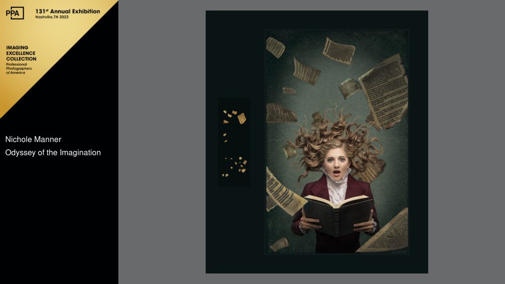
Here is one such photographic artist. I asked Nichole Manner of Jefferson City, MO, about how her wonderful Image Excellence selection titled “Odyssey of The Imagination and Unexpected Inspiration” came to life.
__________________________
When Alanna arrived for her senior session, as most senior girls do, she came with more than she needed. In this case, she arrived with this old-time ruffled blouse and maroon blazer and it was at that moment I gasped and said, “Do you trust me??”.
She looked at me quizzically and I said, “I have an idea, but you have to trust me.”
With little explanation, I asked her to lie down on a plain white floor, holding her very favorite book. She is a bookworm and wanted to highlight that as part of her senior session.
The lighting was actually pretty simple. One single light with a 30×40 softbox ‘overhead’ to create some nice directional soft light. I did not need anything complicated as I already had the vision in my head.
As I stood above her, camera ready, I asked her to close her eyes, and when she opened them to gasp with surprise as if she just read the juiciest part of her novel. That is all. I think we got it in one or two takes.

Making the image come alive came with a LOT of layers and playing with color as you will see in the short progression video. Some changes were subtle, some not so much.
One big thing I was looking to achieve was a fantasy, dreamlike feel, almost painterly (but not quite), and for it to not feel flat. I began with a simple parchment textured background, and built from there, adding flying book pages to create a three-dimensional feel (I licensed these assets – simply because I wanted to save time). One thing I had to consider was the light direction on my subject and the additional elements in the project. Continuity with lighting and color helped this image become more cohesive. I had to adjust a few times before I landed at the final color.
There was a LOT of fine-tuning for details (balancing out hair, building the collar on the shirt to be even…playing with shadows and highlights to give the image more body., and making sure I created a depth of focus with the added elements. Eventually, I got to the point where I could pull back and say, “Ok, it’s done”.
When I create fanciful or themed portraits like this, it usually stems from my need to stretch my boundaries and play. Play with what I know…and learn things I do not. This was not created with image competition in mind, but I was pleased enough with the result that I gave it a go. Funny enough, I entered in state competition, and it did not do as well as I had hoped, but when District competition came around and I needed to fill my case, I gave it another shot.
And, as luck would have it, Odyssey of the Imagination ended up as a contender for a Grand Imaging Award, making it to the Top 10 for High School Seniors. You never know where a little bit of play and discovery will take you.


