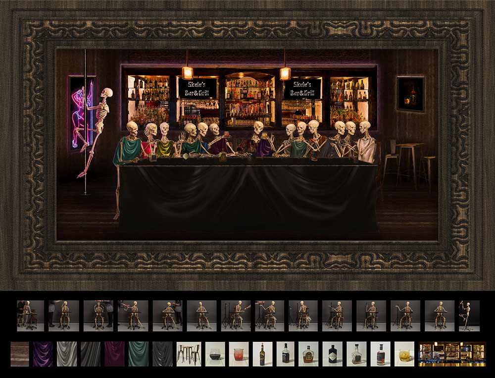
How did this image happen you may ask? Well the simple answer is, I needed some inspiration for some competition images, and I started searching classical famous Art. Works from Michael Angelo, Picasso, and so forth. The initial thought process was what can I mimic using skeletons to create something the judges have never seen before. Although I accomplished that it apparently didn’t impress them enough. (LOL) I also think anytime you bring religious things in it might offend some.
After choosing the Last Supper as well as a few more, the creative process started and with anything of this magnitude, there was some failure at first. Posing the skeleton was the first problem as it wouldn’t bend properly to match each person in the original image. So it required multiple shots of the body parts to get each one.
My wife was kind enough to hold him in the various poses using a chair, fishing line, etc. to get each part in the proper pose. The clothing of course was another issue, each one was created from texture files and color graded to imitate the original. The Background is from a Commercial Job I shot a few years ago. Including my own” Easter Eggs”. The image on the wall on the right is another competition image from a few years ago. (That went Loan – LOL) The floor, walls and table were all created with textures I have photographed. The stripper pole was an afterthought. (Sometimes I tend to go too far, Ha!) My wife thought that might be a little much but agreed it was humorous.
The frame was also made from another texture, in hindsight I should have left it off, I don’t typically like digital frames, however it seemed to work at the time. I honestly didn’t track the hours that this took but I can assure you it was a bunch.
From a technical side, in camera was straight forward all images were shot at 200 & F10, ISO 200 on a tripod of course. Pretty simple lighting set up 2 Rims w/grids, a Main camera right and a large fill at the camera. (6ft umbrella w/sock) The camera used was a Nikon Z6II w/24-70 2.8 lens. As you can see in the reference images, I used a 50% seamless grey background, several light stands were used to help during posing and the chair required a 2×4 with a hole drilled in it to get him to sit. (it’s a medical skeleton) I have used him for several of my images over the years.
Even though this didn’t go IE (which is terribly disappointing) the things that I learned from a photoshop standpoint will just go in the toolbox for later use. I have done lots and lots of these complex composites over the years some with great success others not so much. I tend to favor things on the dark side which may or may not give some offense. I don’t take that into account at all because if I commit to an idea and it tells the story or conveys a feeling, I run with it.
Artists through the ages have created images that are dark, political, and religious. They may go against mainstream thinking or not be Politically correct for the time, but they are Art none the less. If you feel some kind of emotion when see it, then the job as been done well.


