As a professional commercial photographer with a strong sense of artistic integrity, I am thrilled to share the story behind some of my award-winning images. I am honored to have these images featured in the Marathon Blog.
The three photos featured in this article were crafted to highlight the beauty of luxury homes, a market I am deeply passionate about. The images were born from the same process that I follow in most of my shoots and as part of a larger set of images specifically aimed at selling these beautiful homes.
I rarely have the luxury of stepping into a room only to capture its beauty. While I sometimes wish to have that freedom to shoot only for my own pleasure or to prep my competition work, the reality is that I have learned to pivot and leverage the pressure of delivering a commercial product (residential real estate photography) while committing to creating beautiful images by balancing the many elements and complexities of these types of shoots.
The images showcased in this article were created for clients in Houston and were part of three different photo shoots. Now that I look back at them, I see that these images somehow reflect my own journey. I had to learn and draw from my day-to-day work because I did not have time to shoot, only for competition. By doing so, I suddenly found a pool of feedback about my images in every participation, and by iteration and correction from shoot to shoot and contest to contest, I simultaneously improved the quality of my work while enriching my images for competition.
These images have been featured in various competitions, including my dear local guild, the PPGH (Professional Photographers Guild of Houston), state competitions (Texas PPA), and the International Photographic Competition (IPC). Each time, I listened to feedback and refined the details the judges pointed out. I must confess that, in the beginning, it wasn’t easy; if you have ever entered an image at a print competition and seen your image going through the scoring process, you know what I mean. I know that, for every photographer, our images are our babies, we love them passionately and believe in them with our hearts.
Every participation in print competitions, regardless of any awards or recognitions, has helped me produce better images by making me pay attention to details not only during the editing process but also while shooting, enhancing my skills as a photographer.
I am always looking for how to improve my work, and now that I am attending the PPA Jurors Workshop myself and looking to join the PPA Merit Program Review as a judge, I am learning new skills to evaluate images and give back to help other photographers when they take the competition path. I also further realize now how much more is happening behind the scenes. How little time judges have to take in an image and make a decision, and I can tell it is hard for a judge to evaluate an image outside of their usual field of work.
About my shooting style and choices, I primarily shoot in HDR, combining three images with two-stop differences between them. However, I’m not a fan of HDR colors due to the warm tones and color shifts, especially when they affect the whites in an image. To address this, I utilize Adobe Lightroom to create my HDR images and adjust the colors to maintain the natural lighting and original colors. I also prefer not to use external lighting, which often alters the room’s ambiance. Instead, I aim to capture the space as it naturally appears.
As a lifelong Canon shooter, I value the reliability of their cameras and lenses. Canon’s customer service has been outstanding, especially through the Canon professional services program. I moved to mirrorless with the release of the Canon R5 and R3, but the images featured in this article are from a few years ago when I was still shooting with my 5D Mark IV.
My favorite lenses include the RF 70-200mm F 2.8 L and the RF 24-70 F 2.8 L for portrait work, and the ultra-wide-angle rectilinear 11-24mm f/4 L, which I’ve used almost exclusively for architectural photography since its release in 2015.
About lens selection for my work, I have carefully compared Canon’s 17mm tilt-shift lens, released in 2009, with the 11-24mm wide angle, released in 2015, and after a thoughtful field test comparing them in the same settings and situations, I found that both lenses have similar sharpness and foreground distortion.
The 11-24mm has four aspheric lens elements, which help this lens minimize distortion from the center to the periphery and throughout the zoom range. This really makes this lens one of the best ultra-wide angle lenses, with very close results to the tilt-shift, making it a wonderful choice for architecture and landscape work.
Ultimately, the practicality of shooting at different zoom ranges led me to choose the 11-24mm lens for its versatility and ability to capture entire rooms without changing lenses or stitching images in post-production. This simplifies my process, allowing me to focus on composition and details, ensuring that every image I capture is intentional and serves a purpose.
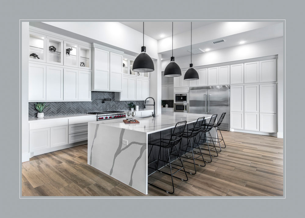
Regarding the specifics for each of these beautiful images, “My Dream” was one of the last homes I shot with my loved Mark IV before upgrading to the mirrorless Canon R3. I chose the 11-24 lens at a focal length of 18mm; the exposure was 1/15, and ISO 100 with an F-stop of 10. This image earned multiple recognitions, including a Gold Medal in the Commercial Category at IPC 2024, Best Illustrative Architecture Image at TPP2 2023, a Yellow Silver Rose Medal at TPPA 2023, and the Best Commercial Image at the PPGH 2023 annual print competition.
I truly love the way this image comes all together. It is a very modern home with minimal details. I chose to keep the lights over the counter off and adjusted in post the color temperature of the other lights in the room to match the daylight coming through the windows so I could showcase the beautiful white cabinets.
If you follow my competition work, you will often see these open, clean, luminous white kitchens come once and again, which is not casual. I love kitchens; for me, it is the best part of every home, and I feel connected when come across a beautiful space like this during my work.
My family usually gathers in the kitchen. I also like cooking from scratch, which I learned as a child, cooking with my grandparents in Buenos Aires. My parents kept the tradition over the weekends, even when we moved away from the big city and into the open lands of Patagonia, and I do the same with my children now in my dear Texas.
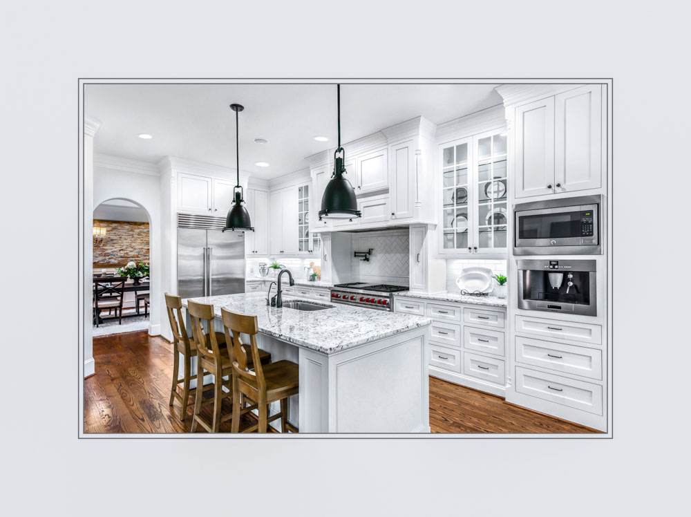
About “The Heart of The Home,” I again was shooting with my Canon 5D Mark IV and my Canon EF 11-24mm f/4. My focal length for this shot was 20mm, my exposure time was 1/6, the ISO was set at 160, and the f-stop was 13. This image made it to the IPC 2022 Excellence Image Collection, obtained a merit in the TPPA print competition, and also merited at the PPGH print competition.
This image aligns with most of my commercial work because it is bright and luminous, with plenty of white and well-defined lines. I chose to turn off the over-the-island lights to prevent them from calling too much attention to that area of the image and avoid the yellow color cast that these tungsten lights usually produce on the countertops. Finally, I worked hard in post to bring back some of the burned-out areas towards the back of the image, in the backsplash over the kitchen counter.
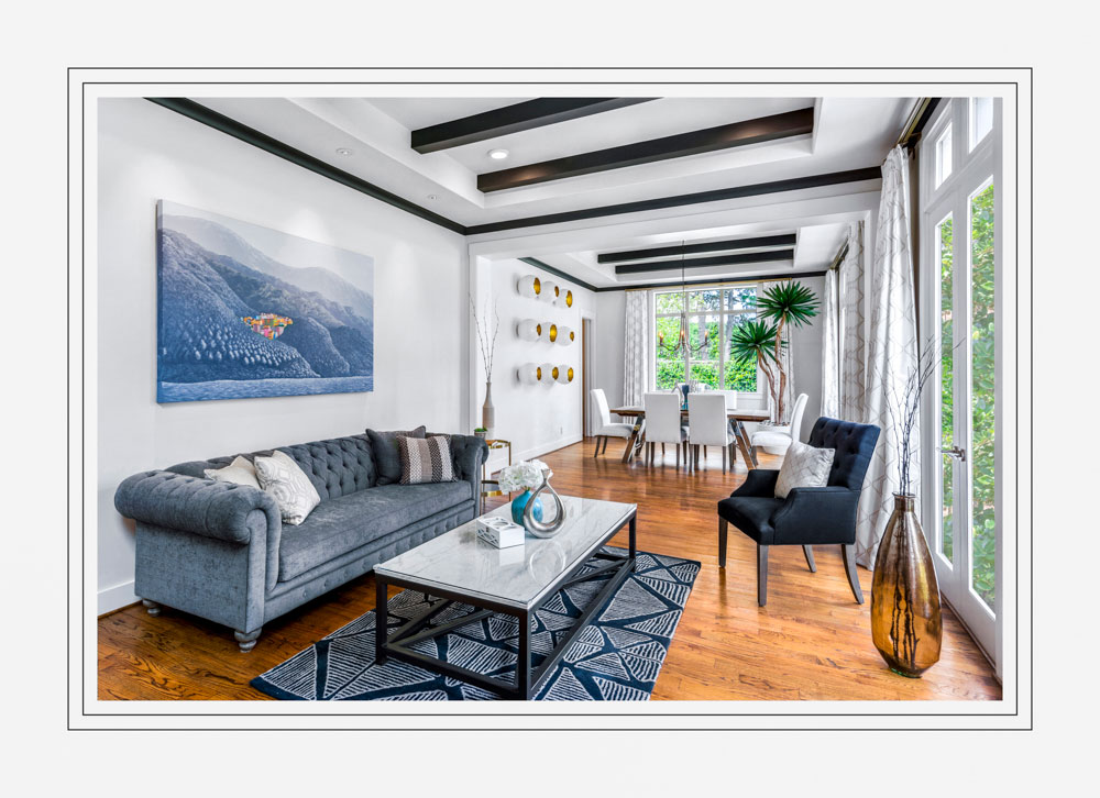
Finally, on “Please, Take a Seat,” I was shooting with my Canon 5D Mark IV and my Canon EF 11-24mm f/4 lens with an 18-mm focal length. The exposure time was 1/40; my ISO was 100, and my f-stop was f/9. This image made it to the Excellence Image Collection on IPC 2022 and earned a Texcelence at the TPPA 2022 print competition. When shooting this room, I felt that a straight shot would not really capture the way the colors and the leading lines worked for the room, and I decided on a “riskier” approach by placing the tripod across the major diagonal leading towards the door in the back.
Shooting the diagonal created a dynamic energy between the many lines cut by the wooded beams, the dark-colored trim, and the main leading lines between the floor, the walls, and the roof. Once I saw the image back on my computer, I loved the result and decided to present the image for competition with a bold double key line on the white mat, adding to the effect.
However, I hesitated when considering it for competition because I knew that any judges with experience in shooting real estate would be inclined to consider the angle choice a mistake without maybe seeing that a straight angle shot would have “flattened” the energy out of the room. Of course, a trade-off of my decision was that the image seemed “to lean” toward the right, especially when looking at the floor. Judges certainly debated that point during scoring. Finally, during editing, I decided to replace the windows with a nice greenery that will color-complement the blues and greyness-blues on the left front side of the image.
Making an artistic call on an image born from a commercial category is always challenging, but what makes me feel confident about “Please, Take a Seat” is that, besides having a good, strong initial impact and a well-defined center of interest, the image is rich in elements that retain the attention and provide the eye with a pleasant feeling. It feels interesting and welcoming to me.
When it comes to art and photography, I love a quote from the Spanish artist, Joan Miro: “You can look at a picture for a week and never think of it again. You can also look at a picture for a second and think of it all your life.”
While “Please, Take a Seat” is by no means an artwork that will end up in a museum, I like to think this image captures a bit of what Joan Miro meant.
In summary, while the process at the heart of these images is anchored in a commercial real estate workflow, with all the restrictions and constraints created for short delivery times, I did not want to compromise the potential to bring an artistic perspective to the shots which, in turn, allowed me to have better base images to enter in print competition. All of it has helped me improve my skills and develop my craft.
If you would like to follow more of my journey:
- Please feel free to connect with me on Instagram @instagram.com/sabrinacasasphotographystudio/
- I welcome you to explore my Luxury Real Estate page at: https://www.luxuryrealestatephotographer.com/


