Intro by Skip Cohen
Bob Coates shared this post on his blog, Successful-Photographer and it’s especially relevant this time of year. So many of you are involved in fund-raisers and community events, and so often you’re sending out images to the local paper.
Whether you utilize Bob’s technique or have another method of conversion, his point is so timely. The last thing you want is for a newspaper to take control of the quality of your images. The best way to prevent that is to control the situation and give them what they need right from the start!
And, all of you should be sending out at least one press release each quarter about something you’re doing, involved in or working on. (Ideally, you should send out one a month!) Stories in local papers don’t magically appear, and nobody can toot their own horn better than you. Don’t be afraid to crank up your own publicity machine.
You never know when a local paper, magazine or website is going to be looking for material to fill an unexpected hole or storyline.
by Bob Coates
If you send out press releases or images for ads that will be appearing in newspapers I highly recommend a few steps to ensure that you get good looking images when the paper goes to print.

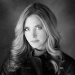
Number one – Do not send a color image unless it is possible the image is going to be printed in color. Many times in the newspaper world since they are on deadline and shorthanded the conversion from a color image to black and white is to desaturate the image. Period. There is no consideration for the tones or where they fall or what colors are going to come forward. I highly recommend using a method I have made with a Photoshop Action.
Convert the file to LAB Color Mode In the Channels Palette Select the B Channel and Delete it. Then Select and Delete Channel Alpha 2. Convert the file to Greyscale Mode. Convert the file to RGB Mode. Add a Curves Adjustment Layer. Pull down on the 3/4 tone and up on the 1/4 tone in the Curves Dialog box adding contrast to the image.
This makes for a pretty clean BW and with the Curves Adjustment Layer, you can make changes to the highlights and shadows if necessary before saving the file. The other thing that will help your image stand out in newsprint is to sharpen your image until it almost looks too crunchy on your screen and when printed with the spread of ink it will be sharp in print. If an image is not ‘oversharpened’ this way the spread of ink will make it look soft.
Here’s what I do…
Flatten the image. Go to Filter > Sharpen > Unsharp Mask with these settings – Amount 500% Radius 1.7 Threshold 7. Your image will look frightening! Wait there’s more… Go to Edit > Fade Unsharp Mask Change the Mode to Luminosity and fade to 40% Opacity. Your image will look a bit sharp but will print beautifully on newsprint at these settings.