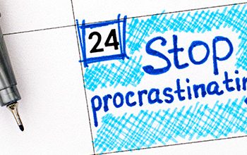
As seasonality in the photography business starts to kick in, there are some easy things to finetune to help build a stronger relationship with potential clients. One of them is very simple to understand – stop scaring your clients!
Digging back through some of my own archived posts, I want to share one of my favorites. This is “low-hanging fruit,” something you can do that’s easy to fix and also has a fast ROI!
There’s an expression in business I learned years ago called “managing by the exception.” It’s most often used in reference to a company’s policies when there’s no extensive history behind a particular procedure, except a single incident that happened in the past.
Here’s the perfect anecdotal story:
A little girl is watching her mother cook a roast beef, and she cuts two inches off the roast and throws it away. She asks her mother, “Why?” Mom says, “Because that’s the way my mother used to cook a roast beef.”
The little girl goes to the grandmother and asks, “Why do you cut two inches off a roast beef before you cook it?” The grandmother replied, “Because that’s the way my mother taught me to cook a roast beef.”
The little girl has one more shot at understanding the mystery and asks her great-grandmother, “Why do you cut two inches off the roast beef before you cook it?” The great-grandmother held her hands about 8 inches apart and said, “Because I only had a pan this big!”
So many of you have policies with little or no contemporary justification. For example, I see a lot of websites with policy statements about deposits and cancellations, apparently the result of somebody getting “burned” and making sure it never happens again.
I’m not against policies and procedures, but they don’t belong on your website.
- Your home page tabs are your most valuable real estate. Don’t waste space with policies and procedures that can be discussed after a client has contacted you to book a sitting or an event date. I’ve read a few deposit policies so strongly worded they’d scare an IRS auditor! Let’s make a visit to every corner of your website a great experience.
- Keep it light! Your website is your storefront and should represent your creativity and skill set. Don’t bury your talent under an abundance of text and disclaimers.
- If there is a procedure or policy you feel people have to know about before contacting you, then write it in a way that’s helpful and reflects a positive spirit.
- If you have a policy that absolutely has to be on your website, put it under an “Information” or “About your Event” or “About Your Session” section. You don’t need a tab called “Policies.”
- Don’t let your website sound like the disclaimer of possible side-effects of a new drug advertised on television.
Most important of all, wherever you do have text on your website, keep it short and to the point. Remember a picture is still worth a thousand words and the purpose of your site is to get people excited about your work. The best way to do that is to dazzle them with great images.