by Skip Cohen
You should consider your About Page as one of the two most valuable pieces of real estate on your photography website with number two being your gallery pages. Stop wasting that space with information that could put a rock to sleep! You need to show your clients your heart, passion and the reason why you are their best choice as a photographer to capture their precious moments. Here are some tips on how to make your About Page reflect you in the best light.
- Remember your target audience is almost exclusively female. Women make 98% of the purchase decisions to hire a professional photographer in the portrait/social specialties.
- Nobody cares how you got started, what awards you’ve won at PPA or WPPI, what gear you use or how long you’ve studied to be a photographer.
- Clients want to know why you love being a photographer. They want to know if they can trust you to capture the images they cherish. They want to know if you’re a good storyteller. They want to hear how much you love capturing memories, emotions and moments they might miss.
- Your Bio/About section is a chance for you to show your heart. It’s a time to be romantic, sappy and share your passion.
…and a few technical tips:
- Sign your About page with your signature or a facsimile. Make it personal and more like an artist’s statement.
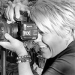
- Let’s get rid of cheesy head shots that have nothing to do with who you are. Get a decent environmental portrait of you with a camera in your hands or actually photographing a client.
- Stay away from tons of personal stuff that’s not relevant. I’ve seen About pages with whole paragraphs about the artist’s hobbies, their pets, families and even their favorite foods. You don’t need to be entertaining, but you do need to be sincere.
- Keep the section relatively short – three to four paragraphs.
