by Mark Weber, M.Photog.Cr, M.Artist, CPP
Do you remember the old 7-Up commercial? The one that said it was the Uncola? I’m giving my age away, but what a brilliant marketing campaign. They certainly were not the only non-cola soda on the market, but they were the only ones who promoted it so clearly. It was an easy to understand (and obvious) message and it was very successful for them.
Speaking of success, talking with successful photographers all over the country inspires me. Their ideas and creativity often seem endless and it can be in the form of photography, Photoshop techniques, Corel Painter skills, photography marketing or branding pieces that represent their business personality. Everyone is as unique as his or her own fingerprints, but how in the heck do you communicate that? How do you create your Uncola?
I was on the phone recently with one of our MAP members, Ramon Nayar, ISO Splash Photography, Naperville, IL. Besides being one of the most talented and versatile photographers I know, he is also what I call a “warm strategist”. A “warm strategist” is someone who thinks things through and prepares for future growth with the consumers experience in mind. He shared some things with me that I have included in this post.
ISO Splash Statement
#1 – Nothing is standard in my studio, including crops and sizes.
Brilliant! It’s simple and easy to understand. This statement could be repeated during a conversation or added to any marketing piece. It hits you like a slap in the face, but in a good way. Can you imagine how refreshing that must be to the consumer? Nothing is standard. What? Where is the same old line I get from all those other photographers who talk about 8×10’s and 20×24’s? If nothing is standard then that means I won’t look average or standard either. I won’t have an average or standard experience when I come the studio. See where this is leading?
ISO Splash Statement
#2 – I want people’s jaws to drop when they walk into my studio.
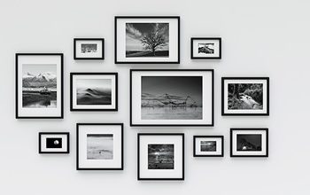
Regardless of where you meet with a potential client, a studio or on-location, wow them in every way. Tap into all the senses (there are actually more than the 5 senses http://www.todayifoundout.com/index.php/2010/07/humans-have-a-lot-more-than-five-senses) but make sure you tap into the main 5 – sight, sound, taste, touch and smell. Pleasant aromas, something tasty to snack on, fabulous press printed materials with interesting folds and textures to see and touch and pleasant music playing in the background. All of this adds up to little things making a big difference. Your work has to be visually stimulating and displayed in a way that inspires people similar to what a furniture showroom does at a furniture store. Inspiration for multiple products begins before the session, not after.
ISO Splash Statement
#3 – I explain to my clients how we are going to change the whole atmosphere, environment and mood in a room with the prints they purchase from me.
Ramon observes space and people and he knows how and what to say naturally to build rapport and get the customer excited. When you are genuinely excited, it transfers over to the customer. An overall “room experience” is much more exciting than talking about print sizes or inches. People can’t relate to inches, to them it sounds like feet. If you put it in context of the emotional state of ownership, then it becomes more than paper and inches. It becomes more about the room and how that room is going to make you feel every time you walk into it.
In addition, most consumers don’t know how to decorate. Do you ever watch those HGTV shows where they transform a room from ugly to gorgeous? That’s what the right display of your images can do for the consumer’s room. I’ve always thought it would be cool to create a photography promotional piece showing a before and after room makeover using portraits. Anyone want to try it? Give me a call. How different would that be from what the competition promotes?
What are you doing to be different? You might take black and white photography, but how is your black and white photography different from your competition? What products are you offering that are unique and exciting? Is it time to reinvent your studio? Go study under a new mentor. Maybe get a new background or start a new product line. Refresh your brand and website. Get that cool new press printed piece you’ve been talking about forever with fun folds that screams “you’re different”. When you do these things, it’s like wearing new clothes. You not only look better, but you feel more confident, creative and productive.
Life is too short. Don’t be average or standard! There’s too much of that in this world and you are way too talented. Tell the consumer how you’re different and why you’re great. Why they should pass 5 other studios to come to you and gladly pay more for what you do. Now that is effective marketing! Ask yourself why you pay more at your favorite restaurant and what you can do to create the same buzz about your studio. One last hint – it’s the little things along the way that make the difference.
